 Here's a more colorfully green image shot the same day. It's slightly cropped as I couldn't get as close as I would've liked, but that's why they invented cropping, eh?
That's known as channeling your inner Canadian. It's something worth doing every now and then.
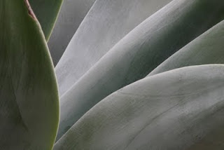 Lin requested that I post the original color image, too, so here it is. In actuality the result is not much different from the other in terms of tonal changes. Instead of black and white, it's a greenish-gray and white, with the whole range of variations incorporated into that shade.
It is rather calming, as greens tend to be, but I think the pure black and white is more striking, or at least culturally carries more gravitas. I don't know...what do you all think?
I have other images that are a bit more vibrant in the greens than this one. I will post them at a later time.
 We had actually been to the Huntington in February as well when Tina's sister, Lin, came for a visit. While wandering the cactus garden, something we don't usually do, I took a shot of this Agave plant. We liked the look, but Tina suggested I convert the original color image to black and white.
This is the result. I'm rather pleased with it myself. There's something very sensual and flowing about the Agave that makes it endlessly fascinating to capture.
 I don't know why I'm so fascinated by Koi, but I am. I guess it's the way they come up to be fed, like little hungry baby birds. It's their mouths that really crack me up, truth be told.
So naturally I gravitate to the ponds where the hungry Koi swirl and splash in wistful longing for someone to please feed them, da*n it! Invariably someone does (no, not me) and they go crazy with delight.
Here is one such swirl. Or perhaps we could call it "a gaping of Koi?"
 I thought it was especially appropriate that while we were at the Huntington Gardens to met our Canadian friends, two Canadian Geese were frolicking in the pond in the Chinese garden. They were particularly attached to the root system of this water lily and spent several minutes nibbling happily away. It made for a very pretty picture, eh?!
 My, how time flies when you get busy. I did not realize a month had passed since I last wrote, but there it is. Between getting Tina ready for her inaugural Art-in-the-Park foray and my articles for work, it seems there is very little time left for blogging.
Nevertheless, I am going to try to post more frequently, even if the verbiage is minimal. I'm assuming people would rather look at pictures than read my blather. So here we go.
We had two good friends come down from Canada for a surprise visit. The Huntington Library and Gardens was chosen as a mutual place to meet them and a couple of their other friends. Before lunch in the Rose Tea Room (a must!), we wandered the grounds. The rose garden was in full bloom. This bunch caught my eye and smelled wonderful, too!
Ah, Spring in the Huntington! There's nothing quite like it!
 The beautiful color schemes of the 1930s, the so-called "Golden Age" of aviation (and not just for those Chrome Yellow wings, either), gave way to the realities of impending war. Gray/Blue topsides and Gray bottoms became the first iteration of the many World War II schemes that we saw in the first CONA post. The difference here is the "Neutrality" markings that theoretically identified U.S. aircraft as off-limits to combat (unless it was to protect U.S. shores and waters). To that end the pre-War national insignia of a blue roundel with a white star and a red center remained on the aircraft, but now in six positions (upper left wing, upper right wing, lower left wing, lower right wing, left and right fuselage sides) for greater visibility. Thus the eternal dilemma was revisited: how to have enough camouflage so your opponents can't see you too quickly, but with enough visibility that your own side won't shoot you down by mistake.
 To aid in that visibility red and white stripes (eventually standardized at seven red, six white like the U.S. flag) were painted on the rudder of the vertical tail. It still added a dash of color to the very subdued war camouflage. The Northrop (now Northrop Grumman) EA-6B Prowler (the first photo) and this Beech TC-12B (above) are really nice recreations of that early 1940s scheme. Alas, it was not to last as the attack on the U.S. Pacific Fleet at Pearl Harbor on December 7, 1941 plunged the nation into war.
 The red and white stripes went fairly quickly. But so, too, did the national insignia with the red center. It seems that nervous gunners on ships and ground units, and even in bomber aircraft as well as fighter pilots, took to shooting at anything with red in it as being automatically Japanese. After a series of "friendly fire" incidents, all red was removed from national markings on all U.S. aircraft, and any other markings period in the Pacific Theater. By the Battle of Midway, in early June 1942, the red was gone. This Lockheed (now Lockheed Martin) S-3B Viking is a nice representation of that Midway era scheme.
And yes - there will be more to come....


 Here's a more colorfully green image shot the same day. It's slightly cropped as I couldn't get as close as I would've liked, but that's why they invented cropping, eh?


